Emerald green jewelry sings with yellow gold's warmth, gains modern edge from platinum settings, and finds subtle harmony with monochromatic gem accents—prioritize metal undertones and stone saturation to maximize its lush character in any light.

It happens when you finally try on that heirloom emerald brooch: morning light hits the stone differently than boutique lighting, making you wonder if your silver necklace clashes. Or perhaps you’re selecting earrings for a silk emerald-green dress, questioning whether rose gold disappears against your skin tone at evening events. Some seek quick pairing rules; others want to understand why cool-toned metals intensify the gem’s saturation in daylight, or how necklace chains change color dynamics when brushing against fabric. Whether you’re matching jewelry to existing pieces, evaluating settings under office fluorescents, or avoiding common myths about metal compatibility – your focus shapes what answers matter most.
If you’re captivated by how light transforms emerald green from morn to midnight, this section unravels why certain metals amplify its drama while others stabilize it. We’ll explore color relativity without dense theory—keeping it grounded in daily encounters.
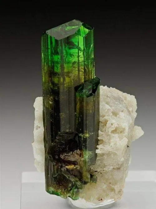
The warmth of yellow gold isn't just aesthetic—it generates thermal contrast that amplifies the gem’s depth, especially in morning or candlelit settings where shadows lengthen. Cool-toned metals like platinum provide sharp boundaries that concentrate emerald saturation, particularly under bright retail or afternoon light. Note that pavé diamonds surrounding an emerald may scatter light in ways that alter its perceived tone; this can soften transitions during golden-hour gatherings. Ambient conditions matter too: muted daylight tends to reward warmer metals, whereas stark office fluorescents often heighten cool metal contrast.
High-polish settings generate crisp reflections that spotlight the emerald’s clarity, while textured finishes like brushed gold soften boldness – ideal when wanting softer harmonization with patterned fabrics. Cabochon-cut stones generally showcase denser color interplay than faceted ones because their rounded shape redistributes light internally. Three observable cues reveal a metal’s influence:
For readers coordinating jewelry with real-world scenarios—like office lighting shifts or evening dress codes—here’s how to maintain visual logic without constant accessory changes.
Yellow gold bezel settings protect vulnerable emerald edges while framing color contrast consistently—a pragmatic choice for daily commutes that demand durability. For black-tie events, pair emeralds with clustered sapphire accents; the cool blue anchors green without overwhelming it while catching theatrical lighting beautifully. Multi-stone arrangements with shared prong settings can create gradual hue transitions, easing the strain on the eye when moving between sunny courtyards and dim cocktail lounges. Remember that cabochon cuts retain their richness better than faceted stones under inconsistent illumination common in parties or gallery openings.
White gold requires rhodium plating every few years to maintain its cool neutrality against daily skin contact and environmental exposure. Low-karat gold alloys (14K or below) develop warm patina over decades, subtly shifting compatibility with your gem—anticipate this slow metamorphosis for heirloom creations. Tension settings maximize emerald visibility but may need periodic tightening if worn during physical activity, whereas secure bezels or channels withstand regular use better.
When metals themselves are the focus—whether matching existing collections or building a versatile tray—these scientifically vetted approaches minimize clashing across contexts.
Platinum’s natural coolness intensifies emerald green saturation against ivory fabrics or pale skin tones—yet that same starkness can fragment cohesion with warm autumn coloration in landscapes or interiors. Layered yellow gold chain necklaces soften emerald formality for daytime offices through gentle diffusion of light and shadow, avoiding harsh boundaries visible under fluorescents. Notice how these factors shift interactions:
Contrary to prevailing myth, mixing metals creates dynamic contrasts that can modernize emeralds—a matte yellow gold base paired with platinum prongs harnesses both color theories to frame the stone. Another fallacy insists emeralds "disappear" against green clothing; actually, monochromatic gem accents create tonal depth when stone saturation exceeds fabric dye intensity. Oxidized silver provides effective grounding for deeper stones in autumn palettes without leaching vibrancy as bright silver sometimes does in daylight.
Those prioritizing longevity alongside beauty will find these cues essential for spotting pieces whose harmony persists beyond first impressions.
Bezel depth exceeding 1.5mm around emerald edges typically indicates robust protection for softer stones vulnerable to chipping during active use. Prong-set diamonds encircling an emerald should not extend substantially taller than the primary gem—this imbalance creates shadow pockets in overhead lighting and may snag fabrics. Highly included stones interact unpredictably with artificial light; test them under smartphone torches to mimic restaurant sconces or gallery spots.
Thinner chain necklaces allow more skin contact, subtly warming steel or silver against the body for seamless blending with olive complexions. Flat-profile settings under 3mm height are less prone to catching during commutes yet require vigilant inspections to ensure stone adhesion remains flush over decades. Tension settings showcase clean color boundaries brilliantly but demand periodic professionals checks for structural integrity.
Consider temperature first: if morning reveals warm undertones in your skin or wardrobe foundations, try a matte gold bracelet—smallest stone forward—to gauge subtle interactions across office and dinner lighting. For gifts, evaluate the recipient’s existing metals against three contexts: daylight workstations, evening ambiance, and preferred garment textures. And when uncertain between platinum or gold, oxidized silver bridges both worlds by day while disappearing into twilight. The truest pairings don’t shout; they simply resonate as naturally as leaves catching sunlight.

$