Emeralds, with their distinctive green hue resonating with growth and vitality, have been historically linked to prosperity concepts in various traditions. As physical objects, they carry cultural symbolism through color psychology and material properties: the depth of their green may be perceived as embodying qualities like renewal in some belief systems, while their light-reflecting crystalline structure creates tangible visual presence in daily environments. Any association with wealth attraction stems from these aesthetic and symbolic interpretations rather than intrinsic properties.
You might be reconsidering the jade pendant received as a gift, noticing how its green shifts under office fluorescents during a budget meeting. Perhaps you're observing a vintage emerald ring in a museum display, wondering why certain stones consistently appear in heirloom collections. Or maybe scrolling through home décor accounts, you've paused at emerald-hued velvet cushions positioned near entryways. Whatever brought you to this question, your underlying focus likely differs from others: some seek concrete definitions; others evaluate cultural symbolism; many prioritize practical aesthetics or long-term wearability – each perspective reshaping what a satisfying answer requires.
For readers drawn to cultural connections rather than gemology, this section clarifies how color traditions shape interpretations. Emeralds operate within systems where hues carry narrative meaning – consider their role before assessing potential personal use.
Emeralds gained prosperity associations partially through their vivid coloration echoing renewal cycles. Their saturated green tends to maintain consistent depth across daylight and interior lighting, which helps sustain symbolic associations in different environments. Cultural frameworks link this chromatic presence to growth metaphors, translating into abstract concepts like wealth attraction over generations.
Some spatial traditions position materials based on color-energy correlations. An emerald's geometric cutting style or metal setting can influence how it interacts with light vectors within room layouts. When used intentionally, its reflections may enhance textural richness through layered contrasts. The stone's visual weight tends to anchor arrangements through density and hue concentration.
Here we examine physical attributes affecting daily wear and perception. Understanding how light, inclusions, and settings create visual language helps appreciate emeralds as functional objects rather than symbolic constructs.
Natural emerald characteristics include inclusions known as "jardin" (gardens), visible patterns that help identify untreated stones without compromising integrity. These formations refract light uniquely and contribute to each stone's fingerprint. Under magnified examination, authentic pieces exhibit mineral veiling that may diffuse light into softer glows rather than sharp reflections.
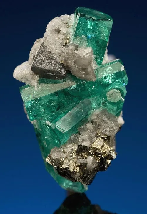
An emerald's cut optimizes how its crystalline structure captures illumination. You might notice: directional lighting intensifies green saturation near windows, while diffused office fluorescents create subtle surface glow, and evening candlelight reveals depth variations. Quality grades prioritize stones showing consistent vibrancy across multiple environments without appearing muted.
Material durability matters for frequent wear:
Readers exploring incorporations into existing routines will find applications balancing aesthetic purpose with practical maintenance. Consider these approaches across personal and spatial contexts.
Necklace pendants or rings bring emerald's color into habitual spaces – catching afternoon light during work commutes or creating focal points in social gatherings. Oval cuts tend to maximize visibility on smaller stones, while bezel settings secure included specimens for consistent wear. Daily use may develop a gentle patina, softening reflections without diminishing presence.
Decorative objects incorporate emerald hues through varied interpretations: a polished stone paperweight diffusing morning light across desks, ceramic vases activating visual corners with mineral-inspired glazes, or fabric elements introducing chromatic depth through velvet textures. Placement directionality allows controlled light interplay where indirect sources create dimension.
This section supports evaluation whether emerald qualities align with personal style parameters. Material integrity assessments prevent prioritizing meaning over lasting satisfaction.
Selection balances personal preferences over absolutes: some may appreciate character-filled stones with visible inclusions beneath optimal cutting, while others prefer flawless transparency despite potential treatments. Evaluating specimens under varying lights reveals how different qualities perform practically in your common environments.
Digital product photography often emphasizes saturation; real stones may display slightly more nuanced greens in person due to lighting differences. Natural variations in undertones create distinctive profiles across specimens rather than uniform coloration.
The symbolic significance resonates differently when contextualized personally: one person treasures an heirloom ring for its documentation of family milestones, another selects emerald-hued ceramics simply because the depth of green transforms morning light in a specific corner. What textures or placements might let this color harmonize with your work accessories, home arrangements, or considered gifts? Whether opting for mineral specimens or derived palettes, let the physical interaction – light catching crystalline angles or fabric absorbing illumination – become its own quiet validation.
Does size impact perceived color intensity?
Smaller stones with high saturation can deliver comparable chromatic weight to larger pale pieces through concentrated hue presence.
Can cleaning affect appearance?
Using mild solutions maintains surface integrity; ultrasonic methods risk fracturing included stones despite efficiency.
Why do settings matter beyond aesthetics?
Metal choices influence visual temperature (cool silver versus warm gold) and protection level based on lifestyle routines.
Does natural versus synthetic change the experience?
While material origin varies, well-executed stones create similar sensory impressions through light play and texture.

$