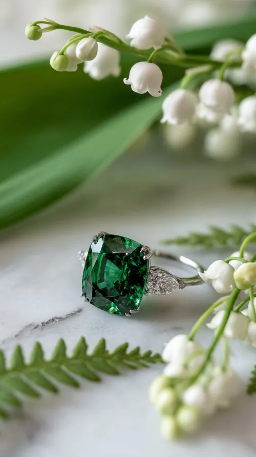
You’ve selected that pendant or ring, its green depths promising a lift to your attire—but pause mid-closet. Office fluorescents? Sunset-lit dinners? Casual brunches? That emerald will behave differently in each scenario. Some seek scientific principles behind successful pairings; others need practical formulas for upcoming events. A few desire historical inspiration behind those legendary royal combinations. Wherever you stand, the variables go beyond “what matches” into how lighting transforms hue, how texture shifts perception, and how your personal presence shapes the final effect.
If your goal is immediate, reliable combinations that emphasize emerald’s signature green with minimal guesswork, focus on these scientifically backed approaches leveraging hue and contrast.
Start with neutrals and deep-toned complements to reveal emerald's luminosity. Rich purples and burgundies create dramatic chromatic contrast that intensifies the green without competition, particularly with deeper-hued emeralds. Alternatively, muted ivories or oyster shades reflect light onto gem surfaces, creating soft brilliance ideal for daytime settings where high contrast may overwhelm. Monochromatic dark greens—think forest or pine—let stones recede subtly for professional contexts.
Apply pairings strategically across scenarios: Pair deep purple tops with emerald earrings for gallery openings where directional spotlights heighten jewel tones. Combine ivory sweaters with pendant necklaces in diffuse office lighting for an approachable sophistication. Charcoal business suits provide neutral canvases that focus attention to brooches or cufflinks during presentations. For summer occasions, consider how emerald rings interact against warm pastel linens.
When you care about underlying principles—why emerald shifts in different lights or how cut influences color interactions—these factors reveal why certain clothing choices succeed beyond simple color theory.
Crystalline structures refract wavelengths differently per environment. Daylight exposes subtle yellow undertones, making warm-toned clothing like rich browns harmonious. Fluorescent lighting emphasizes bluer notes; cooler tops such as slate blue may complement while avoiding clashing. Evening’s incandescent sources deepen green saturation—ideal for high-contrast pairings like plums where lighting intensifies chromatic interplay. Monitor how shadows influence perception: Velvets absorb light creating moodier contexts than reflective silks.
Skin undertones alter green’s appearance significantly. Warmer complexions harmonize with emerald's own possible yellowish notes when worn alongside ivory or russet fabrics. Cool-toned skin often amplifies bluish hints via analogous ocean-tone outfits like teal. Outfit proportions matter: A choker against v-necklines frames stones differently than pendants over high-neck shirts. Silver settings in platinum may appear modern against emerald’s green than yellow gold’s vintage aura.
If adapting to lifestyle needs—protecting stones long-term, accommodating different events, or accounting for seasonal shifts across years—these considerations bridge aesthetics and functionality.
For longevity, consider environment and care habits. Frequent abrasion against coarse textiles may diminish surface polish; softer fabrics preserve integrity. Maintain luster compatibility: Cotton poplin creates matte contrasts highlighting brilliant-cut sparkle, while glossy satins blur reflections. UV exposure risks color fading—avoid pairing emeralds with summer whites worn in harsh sunlight unless pieces are treated. Professional cleaning maintains refraction clarity impacting how surrounding colors interact.
Emeralds integrate year-round via contextual shifts: For spring, pastel backgrounds like mauve or celadon subtly elevate jewelry as accent pieces instead of focal points. Transition into autumn via rich rusts and wines intensifying color depth. Minimalist aesthetics rely on singular emerald pieces against monochrome neutrals, whereas maximalist approaches combine with patterned items bearing complementary jewel tones. Adaptability shines through strategic placement: Coordinate statement rings with solid-color sleeves, or use necklaces to define necklines.
Those drawn to nuanced interactions between gem luster, fabric weave, and stylistic expression will appreciate how material dialogue transcends color alone.
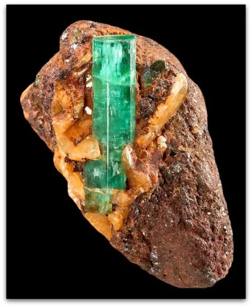
Texture dictates light behavior: Ribbed knits scatter illumination reducing emerald radiance but providing softer integration. Silk charmeuse creates liquid reflections amplifying the gem’s natural glow. Notice how matte-textured crepes provide depth without competing shine. Gem surface quality also changes the equation: Stones displaying jardin (natural inclusions) benefit from simpler fabric weaves avoiding visual noise. Pearled cloth adds luminosity that complements emerald without mimicking its transparency.
Modern approaches suggest deliberate asymmetries: pair one emerald earring against geometric neutrals letting the gem punctuate. Tailored outfits highlight structured jewelry settings. Flowing silhouettes harmonize better with organic stone cuts. Consider metals as intermediaries—rose gold bridges warmer reds with emerald while platinum transitions elegantly into navy or black. Layering chains introduces movement that affects how surrounding fabric tones catch attention differently.
Historical context reveals why certain combinations persist culturally, from Renaissance portraits to Golden Age Hollywood.
European courts favored emeralds against crimson symbolizing power—an intentionally clashing contrast modernized today via berry tones for evening. Victorian mourning ensembles used black velvet backing to heighten the green’s vitality during somber occasions. Golden Age cinema cemented emeralds with metallics and stark whites for photogenic drama easily adapted to contemporary galas. Art Nouveau introduced softer moss-greens complementing deeper stones without competing intensity.
Start simply: Commit to neutrals like oyster or dove gray as adaptable foundations. Then explore contrasts strategically—try plum scarves near office lighting observing shifts. Remember material textures impact perception; a wool jacket creates different context than linen. Store pieces protected from UV exposure that subtly alters tone over decades. Consider how your typical day’s light sources interact with gemstone hue and cut. This jewelry evolves with you. Perhaps start quietly—a brooch clipped to a handbag strap against neutral tailoring. Let it slowly reveal itself in your environment until wearing green gems feels intuitive, an extension of your palette.
Q: Does emerald jewelry require specific metals to harmonize with clothing colors?
A: Metal settings create transitional tones: Yellow gold blends with warm-toned outfits, platinum sharpens against cool colors, while rose gold bridges vivid palettes. No mandate exists—settings can either complement or deliberately contrast clothing schemes.
Q: How risky is wearing emerald pieces with textured fabrics?
A> Textured materials like tweed or lace offer visual interest but may have varying abrasion risks. Gently woven fabrics typically pose minimal threat unless stones have surface-reaching inclusions. For heirloom pieces, select smoother textiles.
Q: Does emerald jewelry transition across seasons?
A: Absolutely. Consider emeralds against linen in summer amplifying brightness, with deeper textures like velvet complementing winter stones. Chromium content remains stable through seasonal light shifts, though color perception may change.

$